 Web Graphics and Animations
This webpage explains some important concepts and best practices about image formats and (GIF) animations, especially for using them in webpages. The first version of this page was written in the year 2001 but I have been updating it ever since and even the original information still applies — aside from some historical references to ancient browsers and software that I left in mostly for fun, like the following paragraph.
Your monitor must be set to 24-bit colour [or 32-bit], i.e., millions of colours or “true colour,” to view the examples in a correct way. Of course this is always the case nowadays, but back in 2001 this was not self-evident!
Contents
Image formats
Before we start, it is important to make a distinction between two ways in which computer images can be represented. The most common way is to use a bitmap, which is a regular grid of pixels. Your computer monitor is also a regular grid of pixels, which makes it easy to display bitmaps. Problems arise when one wants to display bitmaps at different scales than the usual one-to-one mapping offered by the monitor. That is why there is a radically different way to represent images, based on vector drawings. The simplest vector drawing possible would specify that a straight line of given thickness should be drawn between two points. This can be extended to multiple lines, areas, curves, shading, text, etcetera. Drawing these images at different scales is easy: just scale all coordinates and redraw. This article focuses mostly on bitmap images, vector drawings will be discussed only briefly.
The two most common picture formats used in web pages used to be GIF (CompuServe Graphics Interchange Format) and JPEG (Joint Photographers Expert Group). Originally these were practically the only formats supported in most web browsers. A third format, PNG (Portable Network Graphics) eventually gained popularity and is supported by all modern browsers. It has been designed to avoid the patents and licensing associated with GIF, and generally provides smaller files for the same quality than GIF. Even though the patents on GIF have recently expired, PNG still is technically superior so it is expected to replace GIF in the long run, except perhaps for simple animations. Newer image formats will probably keep emerging, like JPEG 2000 or WebP, but those are not discussed here.
It is very important to know the difference between formats like GIF, JPEG, and PNG: this is essential in making pages that both load fast and are of high quality. The goal is to reduce file size—and download time—to a minimum, without making your site look ugly. If you don't know much about image formats, read on. If you think you know, read on anyway, maybe you'll get surprised.
The main difference between GIF, JPEG, and PNG, is the way the images are stored. In GIF and PNG, every pixel is stored as it is, without altering the image data. However, the files do not just contain a raw dump of all the pixels. A type of compression is used to store the data more efficiently by doing something smarter than just concatenating the values of all pixels. This is called “lossless compression.” JPEG on the other hand, uses an adjustable “lossy compression.” This means that in order to make the file smaller, the image is altered slightly. This is done in such a way that it is as invisible to the human eye as possible. More info about this can be found in the paragraph about compression.
Another difference is the amount of available colours: a GIF uses a colour look-up table which can hold at maximum 256 colours. You cannot use more than 256 colours or greyscale values. However, using fewer colours means less data, hence a smaller file. This method of using a limited amount of colours with a colour table is called indexed colour. JPEG always uses either 8-bit greyscale (256 shades of grey) or 24-bit colour (16777216 colours). This means for JPEG there is no (direct) reduction in file size by using fewer colours, but there is no limit on the number of colours that can be used in the same image. PNG supports both indexed colour and full 24-bit (as well as 48-bit) colour, but it only features lossless compression.
An advantage of GIF is that it supports transparency: one can mark some of the colours in the colour table as “transparent,” hence all pixels that have those colours will not be drawn. This allows displaying images of any shape across any background. This is impossible with JPEG, because due to the lossy compression there is no guarantee that the pixels in the saved image retain their original colour. A JPEG image therefore offers no transparency hence is necessarily rectangular. PNG also supports transparency by using a separate alpha channel. This even allows to vary the degree of transparency. Some ancient web browsers were unable to render this correctly, but nowadays this is no longer a problem.
Yet another important difference: JPEG and PNG can only contain one image, so no animations. If you want to make a simple animation, your best option at the time of this writing is likely still to use GIF. The alternative would be an embedded video, but that only makes sense for large animations or movies, and requires browser support. (In the old days one would rely on QuickTime or Flash for such things, but Flash has gone the way of the dodo and HTML5 video has taken over the role of browser plug-ins.) There is an extension of PNG called MNG which allows animations too, but it is not widely supported.
Every recent paint program offers the possibility to save a JPEG in ‘Progressive’ format, which is analog to ‘Interlaced’ GIF: the image is displayed while it is being loaded, and becomes more refined as more data is received. There is only one disadvantage: older browsers and some image programs cannot read progressive JPEG files. But don't worry: nobody uses such browsers anymore today, except maybe the occasional software archaeologist.
![]()
When to use GIF or PNG, when JPEG ?
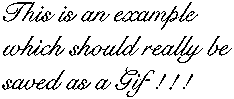
To demonstrate the differences between GIF, JPEG and PNG, the same image (yes, I know it is ugly) is displayed here in each of those formats:

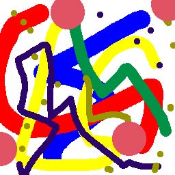
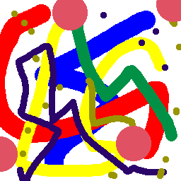
GIF image, 4961 bytes
JPEG image, 18342 bytes
PNG image, 3783 bytes
The GIF image (at the left) takes only 4.8 KiBytes, while the JPEG takes 18 KiBytes! The PNG image is even smaller: 3.7 KiBytes. And if you look well enough, you'll see that the JPEG does not even look as good as the GIF or PNG: the borders between the colours are blurred. This is due to JPEG's ‘lossy’ compression algorithm. By adjusting the compression, I can make the JPEG as small as 8.5 KiBytes, but then it looks really horrible; if I would try to make it look as good as the GIF, it would take even more disk space. So you might think that JPEG is a useless format. Well, just look at another example:
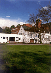
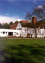
GIF image, 22040 bytes
JPEG image, 11174 bytes
Now the GIF image (at the left) takes 21.5 KiBytes, and the JPEG takes only 10.9 KiBytes! And if your monitor is set to a high colour resolution, you may see that the GIF has a kind of “grainy” look. This is because it can only use a limited number of colours, therefore some colours need to be approximated by “dithering,” i.e., using dot patterns. This does not only deteriorate the image, it also thwarts efficient compression.
So, why does this image take much less space in JPEG format, while the previous example was much smaller in GIF? The reason is: the latter had only 8 colours and consists of large uniform areas. This allows for efficient lossless compression, and only 3 bits are needed to represent each colour. The second image however has many more colours, even more than 256. Here, its GIF version was saved with only 64 colours (6 bits) because it would take even more space if I had used all 256 colours. The JPEG compression algorithm does a much better job here because it is well suited for smooth colour transitions.
What about PNG for such types of images? Well, the situation is more complex. You could save this image with a 64 indexed colour map like the GIF; this would take about 21 KiB in this case, only slightly better than the GIF. It is also possible however to save the original image with all its colours in a 24-bit PNG file, but then the file takes a whopping 76 KiB! This is because PNG does not use a lossy compression like JPEG. Therefore, unless it is absolutely necessary that the image quality is not degraded in any way, on webpages PNG is unsuitable for photographs and other images with mostly non-uniform areas consisting of many colours.
(By the way, if you don't know what a KiB is, I explain this in another article.)
Conclusion: which bitmap format to use?
It is clear that for indexed colour images with few colours, GIF and PNG are the winners, with PNG beating GIF in most cases. So a general rule of thumb for choosing between GIF (PNG) and JPEG, is: if your image contains only few colours, and/or large areas in the exact same colour, you should use GIF or indexed colour PNG, with the smallest number of colours that still faithfully represents your image. Also if your image is really small, like smaller than 32×32 pixels, you should also use GIF/PNG, because a JPEG file has a larger data header, and for such small images it is mostly useless to use more than 256 colours anyway.
For (non-tiny) images with a lot of colours (like a photo, rendered 3D image…), JPEG is the optimal format. Remember, you can (and should) tweak the compression rate while saving JPEG files. You should use the strongest compression that still looks good enough (a preview function when saving is a must). If your image has a lot of detail, use a ‘Good’ compression rate, which introduces only very little fuzz. However, ‘Medium’ or even ‘Low’ will be good enough in most cases, especially when your image has no sharp details (like most backgrounds). For webpages, you should never use ‘Maximum’. Different graphics programs represent the compression ratio with different scales, so it is rather pointless to specify one specific scale here. Just let your eyes decide!
Pop quiz: in which format should this pure black-and-white-only image be saved?
Mystery format #1, 1359 bytes

Mystery format #2, 7887 bytes
In GIF or PNG, right! Mystery format 1 is GIF, 2 is JPEG. As you can see, JPEG is a ridiculous waste of disk space for such images! The JPEG takes 6 times the size of the GIF, and it was even saved in Photoshop's lowest possible quality setting! This causes the ugly noise you can see. I hope that if you remember only one thing from this page, it'll be at least this one...
As for the better performance of PNG compared to GIF: this is only valid if the image is compressed with the best method — PNG supports multiple methods, but a decent graphics application will offer the option to choose the best method automatically, or do this by default. Therefore, if you want to squeeze every bit of redundant data out of your webpage, you should use PNG for indexed colour images and keep GIF for animations only.
This paragraph is historical and outdated. Read it for giggles, or just skip it!
However, the problem with PNG is that it is relatively new, and not (fully) supported by all software. Also — this may sound stupid but that happens to be the way some people are — since it's a free format and not designed by some huge software company, some software developers look down upon it, even though it is technically superior to GIF. Also, some programs have a sloppy PNG implementation, or don't give the option to use the most efficient compression and use an inefficient default instead (Photoshop 7 is an example, even though older versions had this option).
Therefore, I would only recommend using PNG if you know what you're doing, and have verified that your graphics program doesn't cripple PNG's potential.
For saving PNG files in their most optimal format, I can recommend using the GIMP. There are some tools that can further optimise PNG files to squeeze even more efficiency out of them.
Last but not least: if you're not sure whether to use JPEG or GIF/PNG, just save your image in all formats, and look at their sizes: if the smallest file still looks good enough, use it. Remember that most people zap to another page if it takes too long to load images which occupy far more space than they should.
Also, make sure not to include useless data in your image files. Many programs like to include colour profiles, previews, EXIF data, and stuff like that in your images. These are almost always useless to web visitors, and can take huge amounts of space. Turn them off or use the ‘web export’ function of your program, if available. I've seen web comics with 60K of real image data and 600K of unknown, useless metadata. That is a big don't!
Scalable Vector Graphics
For a long time, displaying anything else than bitmaps on a webpage was a hassle. If you wanted to show a line drawing that remained sharp at any size, your only options were to embed a Flash movie or Java applet, utter overkill for just a simple drawing. Luckily, a standard for vector drawings has emerged: SVG, which stands for Scalable Vector Graphics. All recent browsers support it, so it is to be expected that websites will increasingly start using this format. Below is a short demonstration that can be used to see if your browser supports SVG. You should see the word “SVG” three times. This demo also shows the advantage of vector drawings. It is the same image file displayed at three different sizes. The middle image is the size at which it was designed. You will notice that the enlarged version does not exhibit the blurriness and/or jaggies that would be caused by upscaling a bitmap.

Especially with the advent of high-resolution displays (or ‘retina’ in Apple jargon), scalable graphics have become particularly useful because there is no need to provide separate image files for every possible resolution. The image remains crisp regardless of the resolution of the display. It also remains crisp when printed on paper if the web browser preserves the vector graphics when printing (this is not the case for all browsers at the time of this writing).
The process for making vector graphics is completely different than for bitmaps. In essence, a vector drawing is a set of points that are connected by straight lines or curves. A vector drawing can be trivially converted to a bitmap, but not the other way round. So-called ‘tracing’ methods can try to fit vector contours to shapes in a bitmap image, but this only provides good results if the bitmap has clean and clearly delineated shapes. One cannot take any photograph and convert it to an SVG that looks perfectly the same (in most cases the result will look like some artistic impression of the photo and be an order of magnitude larger in file size).
Will SVG completely replace JPEG, GIF, and PNG? Of course not. It is just another tool in a web designer's arsenal. Even though it is certainly true that there are many images currently stored as bitmaps that would be better represented by vector drawings, there are also many images for which it only makes sense to store them as bitmaps. Only someone who doesn't really understand the difference between the bitmap and vector paradigms would make the unfounded claim that SVG is the ultimate solution to everything.
About image compression
(This paragraph is intended for the people interested in the “magic” behind GIF, PNG and JPEG image compression. For the average webmaster this is way too detailed so you may skip this paragraph if you wish, although it may give extra insight.)
I already mentioned the words ‘lossless’ and ‘lossy’ compression. The lossless compression technique a GIF file uses, is a variant of the Lempel-Ziv compression scheme. This is the same type of scheme used in ‘ZIP’ files, and that makes sense because when you compress a text or data file, the compression must be lossless, in other words the data must come out exactly as it went in. In the earlier days of the Web, the GIF compression was patented by Unisys and therefore it was hard to find the details about how it works, and programmers needed to pay a fee when using it in their own software. The last patent expired on June 20, 2004, and free implementations of GIF compression are now widely available.
Lempel-ziv type compression is a fairly simple technique: it tries to describe data as a combination of preceding data. This means: the more repetition in the data (like lots of consecutive pixels in the same colour in an image), the better the compression will work. But, this is also the reason why an error in a ZIP or GIF file is fatal for all data coming after the error: the error is copied into the following data, which becomes completely useless.
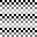
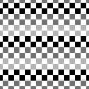
Important about this scheme is that it works in a one-dimensional way, while images are two-dimensional. Therefore a choice had to be made on how to represent images: as a sequence of rows, or columns. The most obvious decision was rows, because that is the way images are usually drawn on a computer screen. Therefore images are read and written in the same way most western people read and write text (left-to-right, top-to-bottom). This has a major impact on how efficiently an image can be compressed. Consider the following two images:

GIF image, 381 bytes

GIF image, 1295 bytes
If you understand what I just said, it should not surprise you that the right image takes more than three times the size of the left image! This is because the left image consists of long rows of the same colour, while in the right image the colours change much more often from a rows point of view. There are some programs available which exploit this fact to make GIF images smaller without noticeable degradation of the image: by increasing the amount of repeating patterns in the rows of the image, compression efficiency can be boosted.
When saving the above images in the PNG format, they take 139 and 128 bytes, respectively. The small difference between both is because PNG can use more complex ways to represent the image than just row-by-row. A good PNG implementation will always try multiple descriptions when saving an image, and pick the one with the best compression performance. PNG also uses a different compression scheme.
The compression scheme of JPEG is a totally different story. This scheme works roughly as follows: first, the image is split up into squares of 8×8 pixels. Then, a Discrete Cosine Transform (DCT) is computed for each square. This transformation gives a kind of description of the square in terms of frequencies. Next, this frequency description is being reduced in such a way that it will have minimal visual impact. This mostly means: throw away the highest and weakest frequency components. The user can determine how much is thrown away, allowing a trade-off between image quality and file size. This reduced description is then compressed with a simple lossless scheme (Huffman encoding) and that's what is in your final JPEG file. Displaying the JPEG is just the reverse operation: decompressing the Huffman code and then computing the inverse DCT.
To demonstrate the fact that the image is divided in 8×8 blocks, here are three images:
JPEG image, 1614 bytes
JPEG image, 6702 bytes
Noise in second image (amplified)
The first two images are compressed with the lowest JPEG quality allowed by PhotoShop. However, the leftmost image has been reproduced flawlessly and takes little more than its GIF equivalent, while the middle image (which is nothing more than the left image shifted over four pixels in both directions) has some noise and takes four times the disk space of the left image! The noise in this image is shown in the rightmost image, which is the difference between the original and the JPEG amplified to make it more visible. This difference in performance is self-evident, since the compression scheme had to work with more complicated 8×8 squares in the second image than in the first — the squares were just plain dumb uniform colours in that case!
You might be wondering what happens if the image is not evenly divisible into 8×8 squares. In that case, image data is simply repeated at the borders until the image fits. So if you really want to squeeze the max out of your JPEG images, make their dimensions multiples of eight.
Mind that even at the highest possible quality setting, JPEG is still not guaranteed to be lossless. This means that opening a JPEG, editing it and saving it back to JPEG, will always incur additional image degradation across the entire image, not just the edited area. Therefore JPEG should not be used for images that need further editing, it is intended to be a ‘final’ format only to be used for displaying, just like an MP3 sound file is only to be used for playback and not editing.
Because JPEG compression is based on frequencies, smooth images compress better than images with sharp components. With “better,” I mean both better quality and a smaller file size, as illustrated in the second pair of images on this page.
By the way, the same conclusions count for most modern video compression schemes, like MPEG, DivX and 3ivx. They also split up the video frames into blocks (mostly 16×16) and use DCT transforms as well. But because they work with multiple frames, they can squeeze out a lot more redundancy by comparing subsequent frames.
Image sizes
When talking about size, there are 2 different aspects: first, the size of the image file itself, in other words how many bytes it occupies on disk or that need to be transferred over the network, and second, the size of the image itself, in other words the image dimensions.
It is obvious that the disk space occupied by a raw bitmap image is proportional to its area. However, due to the compression algorithms of GIF, PNG and JPEG, large empty (i.e., uniform) areas won't take much space. Also, images with lots of repetition will take less space than noisy images. This means there is no simple relationship between the image dimensions and its file size, although in general you may expect bitmap images to occupy more space with increasing pixel count.
For SVG, the disk space occupied by the image file is not related to how large the shapes in it are. File size is entirely dictated by how complex the vector drawing is: the more points and curves, the more data. It is possible to save space by defining and reusing certain structures within the file, for instance SVG allows style sheets like HTML, and markers like arrowheads and the like can be defined once and reused as many times as desired. Because SVG is defined by a kind of markup language, it is often possible to make the file smaller without any visual loss of quality, by rewriting the instructions in the file using the most efficient syntax or dropping redundant digits in floating-point numbers. Automatic tools like SVGO are available for this.
More important is that it is strongly recommended to specify the image's dimensions, its display size, in the webpage itself, even if you just want to display the image at its normal dimensions. E.g., for a 100×200 pixel image, the tag should look like: <IMG src="image.gif" width=100 height=200>. The reason for this is that if you do not provide the image's size, a browser will only be able to properly render the page after at least the header parts of all image files have been loaded. This can result in it taking much longer until the page shows up. Even worse, if the image can't be loaded for some reason, your entire lay-out may get scrambled.
Another important tip: do not make bitmap images larger than they appear on your web page, that is the most efficient way to make users angry because of the slow loading speed. For instance if you have a catalog of large images which can be browsed via thumbnails, do not use these large images themselves for their thumbnails, but use small copies of them that take much less disk space. Otherwise the loading time for your catalog will be as long as for all the large images together and that's just not practical for people with a slow connection! Moreover, it causes unnecessary stress on the web server.
With the advent of high-resolution (or so-called ‘retina’) displays however, larger has become a trickier concept. While bitmaps were originally assumed to be always displayed at 72 or 96 dpi, these days they can be displayed on screens with resolutions exceeding 300 dpi. Images that used to be ‘large enough’ will now be too coarse to appear crisp on such displays. To keep displaying appropriately sized image files on all devices, you now need to provide multiple sizes of the same image and use the srcset attribute to allow the web browser to select the best one. More details can be found on the MDN website.
For very small images like icons, you can get away with only providing a double resolution file, and then specifying half the pixel size as the image's dimensions on the webpage. If the image files are tiny on their own already, making multiple versions and specifying a srcset is overkill. Modern browsers are pretty good at downsampling images on lower-resolution screens. I used this strategy for instance for icons on the topic pages of this site.
Generally, displaying bitmap images larger than their original size is to be avoided because it usually looks disgusting. Only do it to achieve a certain effect, and make sure to use the right style sheet attributes (like image-rendering) to determine how the upscaling is performed, for instance pixelated versus interpolated.
If you can replace a bitmap image with an SVG image, this obviously eliminates all worries about image resolution because resolution is irrelevant for an SVG image (unless bitmap elements are embedded inside it, but you should avoid doing that). For a maximally future-proof website, SVG is the preferred format for basically everything but photos.
Animations
Most people know that the GIF format can contain a lot more than just a still picture. It is even such that when people hear ‘GIF,’ they immediately associate it with ‘GIF animation’. If you ever visited the home page of older versions of this website, you should have seen a lot of examples of this! Assembling animations is possible with some recent versions of drawing programs, or if you do not have any of these you need a separate program. However, since these programs don't offer drawing tools you need a drawing program as well (I used to consider PhotoShop as the best available, but nowadays I only use the GIMP.)
There are enough GIF animation programs available today. In the early days of the web, GifBuilder (freeware, by Yves Piguet) was an excellent Mac program, and for Windows users Gif Construction Set (shareWare, by Alchemy Mindworks) was popular, but there are far more programs now. For Linux, the GIMP has extensive ways to create GIF and MNG animations, and is also ever improving towards a feature-rich image editor.
How does an animated GIF work?
A GIF animation just contains several different GIF images (frames) which are displayed after each other. Each frame can have its own delay (expressed in 100ths of a second), size, position and disposal method. This means that you can build up a large image with small pieces by adding a small part each time. Here's an example of this:
In this animation, each time a part of the sentence “This is an example” was added, without disposing of the previous frame. The result is that each new part is put on top of the previous one, with as final result the entire phrase. If you would take this animation apart, you would get: a white rectangle, 5 small pieces of text, and a black frame.
Making an animation is as easy as creating the different frames and putting them together. Making a GOOD animation on the other hand is a different thing. A common problem are the different colour tables.
Colour Tables
We know that a normal GIF can contain a maximum of 256 colours. This also counts for animations: only one colour palette per animation. The clue is to use a palette that represents the overall colours of the animation. This may look hard to do but is quite easy: just make all the frames in 24-bit colour and when they are ready, put all of them in one big file. Convert this file to 256 colours (or less) with an “Adaptive” palette and save this palette. Next, save all the separate frames in GIF files, using that palette. (In PhotoShop 4 or newer, you can use the ‘Actions’ palette to automate this.) Now you can import the frames in your animation program, using the palette of any frame as the overall palette. The most recent versions of graphics programs that support GIF animations will probably do this whole process for you anyway.
Note: never use the option ‘Remove unused colours’ in any of the programs while doing this, because this can screw up the palette. You can try this while saving the final result.
You do not always need to use all those 256 colours. In fact, it is better to use as few as possible. If you know something about bits and bytes, you should know that a number with x bits can contain 2x different values, a 7-bit number for example can represent 128 different values. So a GIF file with 7-bit colour has 128 colours.
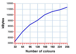 You could think that GIF files can only have a number of colours that is a power of two, but that's not the case. Any number between 2 and 256 can be used and somewhat surprisingly, a file with 200 colours takes less space than a file with 256 colours although theoretically you would also need to use 8 bits to represent those 200 colours. I tested it (see graph at the right) and the file size seems to be approximately proportional to the number of used colours. (This is a result of the compression scheme of the GIF format, see above.)
The morale of this mathematical story is: use as few colours as possible while still keeping the images appealing; your website visitors will be grateful to you!
Transparency in animations
An animation can contain transparent parts, just as any GIF file. The only ‘disadvantage’ of this is that you'll have to ‘sacrifice’ one colour of your palette to do this. Every pixel which has that specific colour will then be transparent. It is recommended to use pure blue for this colour, as it's rather rare in images. But you can use any colour you want.
What is special about transparency in animations though, is that you can use a different transparent colour for each frame in the same animation. Using transparency is not only useful to create non-rectangular animations, but also for optimisation (see below).
Animation speed
As said before, you can specify a delay for each separate frame. This delay is expressed in 100ths of a second (let's abbreviate this to cSec, for centiSeconds).
For example, to create a flashing light you only need two images: one for the light when it's off, one for the burning light. If you want the light to flash shortly each second, you can set the delay for the first frame to 95 cSec and of the second frame to 5 cSec. Notice that you can use totally different delays for the frames. In most ‘classic’ animations however, the delays are the same for all frames.
Mind that very fast animations (with delays of < 10 cSec) will not play fast enough on slower computers. But all frames will be displayed, this means that if the computer is not fast enough or the browser imposes a limit on the frame rate, the animation will be slowed down. (This is different from most other animation systems like QuickTime or video playback systems, which will skip frames to keep the animation's timing correct.) Also mind that even on blazingly fast modern computers, it is still possible that the web browser will impose a frame rate limit and never display for instance more than ten frames per second (at the time of this writing, Safari is an example of this).
Loops
You can create two types of animations: ‘simple’ animations and ‘looped’ animations.
The first type will play its frames only once. This means that the animation will stop at the last frame and that frame will stay on the screen. This is useful to create a banner which comes scrolling or falling onto the screen or so. The animation starts either as soon as the image is being loaded (example: Netscape), or when the entire page has loaded (Internet Explorer) so you cannot specify when it will start, unless you resort to JavaScript hooks.
Looped animations are the most common. As you can guess, the animation will jump back to the first frame as soon as the last frame is reached, and so on. Again, there are two possibilities: you can repeat this loop for a limited number of times, or infinitely. I noticed that GifBuilder and some versions of GCS use a different system: if you check an animation as ‘infinite’ in GCS and open it in GifBuilder, you'll see that the loop is limited though, but to a large number of iterations. So it is possible that some animations will stop running after a long time.
Optimising an animation
It can be very annoying having to wait for a large animation to load, especially if that animation appears to be quite simple. For example, you could make a large image with only a small flashing light in it. It is a bit ridiculous to use for each frame almost exactly the same image, while only a very small part of it changes. The animation will occupy a lot of space this way. So, a solution to this is to use for the flashing light only a small image which covers the area that differs from the previous frame, and put this image on top of the previous frame, at the right position.
GifBuilder automatically checks which is the smallest rectangle that has changes in it, and shrinks the frame to that rectangle. This technique is called “Prune compression” and is also available in GCS.
If you don't understand what is meant here, open this “Weird Stuff” animation (from the former main page) with your animation program. You'll see that only the first frame contains the entire button, the others contain just the lights. I had to do this manually, since GifBuilder only shrinks the frames to the smallest rectangle, it is not able to cut away all similar parts. You need to use a transparent colour for this, otherwise it's impossible to create ‘holes’ in your image.
Making all pixels in each frame transparent if they do not differ from the previous frame, may seem ideal, but this is not necessarily the case. If the transparent pixels are scattered wildly across the image, they may make it more complicated for the GIF algorithm to compress. As explained above, GIF prefers repeating structures so ideally you will want to make holes only if they produce enough horizontally repeating pixels or patterns. But if you have no specialised program to do this, you'll have more work with it than it's worth. GIMP does contain an optimisation algorithm that works more or less in this way.
Optimising can require a lot of work sometimes, but it surely is worth the effort: it speeds up the downloading, so this means people won't have to wait too long for your site to appear on their screen. A lot of people just stop downloading and go somewhere else if it takes too long, so…
Another way of reducing an animation's size is to use as few colours as possible, as described in the “Colours” section.
Backgrounds and animated backgrounds
Using an image as background for your page can improve the lay-out, but there are a few complications which may have just the adverse effect. If you use an image with too many details, it may become annoying to read the text on top of it. Smoothing a too “busy” image may improve reading comfort. The general rule is to make a sufficiently large contrast between text and background. Yellow text on a near-white image is about the worst you can do! There are a few other colour combinations which are a pain to the eyes, like red text on a blue background, or green text on red. And last but not least, there are colour combinations that make text invisible for people with colour blindness. Remember: black text on a white background may look boring, but it is guaranteed to be readable. Please do not reduce the contrast because of some dubious design fad.
A second common error people make when using an image as background, is: they don't set an appropriate background colour for the page itself. With “background colour,” I mean the colour which used to be set with the bgcolor attribute of the BODY tag or its current CSS equivalent, and which will be used as a fallback when a background image cannot be loaded. Imagine you have a page with white text over a dark image, and you didn't specify any background colour. Now what if that image loads extremely slowly, or not at all? The browser will default to a white background colour, and you then get white text over a white page, and that's not quite readable, is it? So, just remember to specify a background colour which represents the dominant colour in the background image.
As for animated backgrounds, there are a few reasons not to use an animated GIF as background for your page. The first and most important, is that an animated background may be extremely annoying if people need to read a lot of text between those wiggling and wobbling things. Only use animated backgrounds if you know what you're doing!
(Historical information for giggles!) Another reason is that some browsers don't support this and in such cases the background won't be loaded at all. The more recent browsers, namely everything from Internet Explorer 3.0 and NetScape 4.0 on, can handle animated backgrounds. If you really want to use one but want to avoid a flat background on older browsers, include a JavaScript which inserts a still image if the browser is below IE 3 or NetScape 4.
With the wide adoption of HTML5 and web video standards, it has become possible to use not just an animated GIF as a background, but a whole video. For some reason video backgrounds have become a trend around the year 2018. In my opinion there is no reason why a video background would be less annoying than an animated GIF. Moreover a video background has the additional nuisance of usually being much larger in file size hence taking longer to download and eating up more of the precious bandwidth on mobile devices, as well as battery life. In other words if you wonder whether your website needs a video background, the answer is most likely: no. Don't simply attempt to use one because it is trendy. Visitors will most likely hate you for it and avoid your website altogether.
Colour profiles
In the good old days, things were simple. Images were just a collection of pixels and an RGB value of (0,0,0) meant the pixel would be black and (255,255,255) would be white, with a linear scale in between, usually mapped to an sRGB colour space. One would expect any specific colour value to look the same everywhere. However, this is only true if all display devices would be identical, which they are not. That's why colour profiles were invented, to model the characteristics of the display device on which an image was created and the device on which it is to be displayed. This allows to reproduce the image on the ‘consumer's’ screen with the same perceived colours the ‘producer’ saw when creating it, within the limits of the display. This becomes especially important when multiple images are to be combined, or images must be combined with solid background colours in a webpage's style sheet.
The problem is that this only works if every step in between the creation and reproducing of the image supports the use of colour profiles. My advice is as follows. You should either use colour profiles all the way, in every step, for every image, or never ever use profiles at all. If you decide not to use colour profiles, set your graphics environment to assume a standard sRGB profile. This is the profile that most browsers will assume for images that lack a colour profile. The added bonus is that when stripping profiles from images, you will save some space (and bandwidth), which becomes considerable if you have lots of very small images. For a page full of small icons, including or omitting profiles can make a difference that amounts to more than a factor of two.
For any website where the accurate reproduction of colours is not of paramount importance, colour profiles are IMHO only an added burden and an added risk of screwing things up. The biggest problems occur when you start mixing images with and without profiles or with different profiles. The degree in which colours will be incorrect in the absence of colour correction will never be enormous. Red will never turn into green or blue, only the tint of colours may change to some degree. If all images are ‘distorted’ in the same manner, chances are people won't even notice it. But if some images are corrected and others are not, the difference between them may be rather obvious and even jarring. It is better to have all images uncorrected than half of them corrected and the other half not. Therefore if accurate colour reproduction is not crucial to you and you aren't certain how to ensure that all your images have a correct profile, it is better to strip off the profiles from all your images.
Are GIFs suitable for video?
In short, the answer is a big no.
This is a paragraph I added in 2017, at a time when for some reason animated GIFs have surged again in popularity, to the point that it has become fashionable to re-encode entire video snippets as GIFs. There are many web services that allow to upload any video and convert it to a GIF file. I can somewhat understand the appeal of this, because embedding a bit of video as a GIF is easy. Any web app (like a chat interface) that allows embedding images, will usually also allow GIFs, because those are treated as plain images.
However, GIFs are horribly inefficient at representing video, because of all the reasons summed up above. A modern video codec like H.264 has much more in common with the JPEG compression scheme than with GIF, and relies on motion prediction to further improve efficiency, hence is better at encoding photographic video by an order of magnitude. In a quick test, I re-compressed a GIF to H.264, and it was 22 times smaller in file size without visible quality loss. This fad is especially puzzling given that people nowadays will often browse the internet on devices with limited battery power, through mobile connections that are limited in bandwidth and/or have a data limit. Next time you think of posting more than one second of more than just a small piece of video as a GIF, ask yourself whether there is no way to just link to the original video file instead.
Conclusion
With this information you should be able to create decent graphics and animations. The only thing I cannot learn you is good taste, which, spiteful enough, is hard to find in some websites… Also, keep in mind that although animations can be fun, they become annoying easily, especially if your website's visitors are supposed to be paying attention to another part of the webpage, like a large block of text. Animations have the most effect when used sparely at the right occasions.