Top 13 Things Not to Do When Designing a Website Anno 2023
Inspired by the endless ingenuity of designers of annoying websites, I am continuing the tradition to update this article every few years.
If you want to know what used to make the internet experience awful in the past, the older editions of this article are still available: 2005 - 2010, 2014, 2017, and 2020.
This article primarly focuses on what I consider ‘classic’ websites (like this very website), that are meant to provide information that can be crawled by search engines, bookmarked, and easily linked to from other websites. Some points are not relevant for ‘web apps’ that are volatile by nature and not meant to be crawled or searchable from external sources.
My hope is that many people will read this text and consider it when making or updating their websites, or at least complain to webmasters if they encounter it in other sites. But the main purpose of this text is mostly to spit my bile and vent my (and many others') frustrations. This means it will contain a large amount of sarcasm, and may seem threatening or insulting to sensitive readers. Read it at your own risk and don't come complaining afterwards. It also means it are my personal opinions. If you think you have good reasons to do any of the things mentioned here, just go ahead. After all, I'm not the Pope or anything.
As always, the points are sorted roughly from most annoying and most relevant to least.
- Walled Garden Syndrome: killing the spirit of the Internet
- Infinite scrolling webpages
- Trigger pop-up or pop-over nag screens at certain moments, and ad-blocker-blockers
- Unnecessary use of JavaScript: resurrecting Flash from the dead
- Brain-dead cookie consent
- Grey text, low contrast
- Websites designed only for some specific mobile device
- Use only relative dates
- Anaemic overly minimalist interfaces
- Turn the website into a resource hog by adding unneeded and untested bloat
- Video backgrounds / spontaneously moving layouts
- Make hyperlinks invisible
- Make it impossible to navigate the website by manipulating the URL
Dropped since the previous version
- Bury the main content inside loads of useless elements: ironically enough, now sort of the inverse is happening, with overly anaemic designs.
- Make the rendering of pages dependent on the loading of non-essential content like ads: this still exists but is now generalised in the section about dependency on JavaScript.
- Send incoming users always to the main page: a classic since the first edition of this page, it probably still exists but there are worse things.
Some previously separate points have also been merged because they are related.
Walled Garden Syndrome: killing the spirit of the Internet
The Internet used to approach what Tim Berners-Lee originally envisioned: a place where information could be shared and linked with no real central authorities, with communication and interaction between all parties providing information. The only hurdle was skill level, which is not a big hurdle because humans have the ability to learn. Recently a few worrying trends have emerged that are not compatible with this vision. Two things stand out:
First, many major sites and some smaller ones as well, have started to set the rel=nofollow attribute on most if not all of their outgoing links. The effect of using this attribute value, is that search engine crawlers should either ignore the link, or in the case of Google, at the least prevent the link from attributing any PageRank to the target page. Some dispute that this is true, but if it weren't, then it would mean this attribute is simply ignored and would be pointless.
For certain websites the ‘nofollow’ value makes sense, especially the ones where users can easily make accounts and are allowed to include links in published content, and it is not feasible for the maintainer of the website to validate every link. In this case the nofollow avoids that spammers can boost search engine ranking of their own dubious websites by posting fake content stuffed with links. This was actually the very reason this attribute was introduced in the first place. In many other cases it makes little or no sense to unconditionally apply this attribute, and it hurts visibility of smaller websites. We end up with a situation where small websites link to the bigger sites without nofollow, while the bigger websites only link back to the smaller sites with nofollow. In essence, this behaviour makes the whole concept of PageRank useless and promotes a monopoly of a select little club of big walled-garden websites, which is a situation that contradicts the entire spirit of the Internet as it was originally envisioned. An example is GitHub, which sets this attribute on links in for instance README documents. The result is that none of the links in my very own GitHub repositories contribute anything to the search engine ranking of my own website, even though I control both. There is no way to override this, this is stupid.
If you run a website where users can create accounts and post content that may contain links, then perhaps you should find a way to give users a trustworthiness ranking, and drop nofollow on links created by users who score well enough on this ranking. If on the other hand you run a small website and believe that using nofollow everywhere will magically prevent PageRank from leaking away, then consider that Google and maybe other search engines are likely to penalise websites that have such unnatural link distribution.
Note that two alternative rel values have been proposed in 2019 to allow fine-tuning the intention of a link: a ugc value indicates that the link is from user-generated content, and a sponsored value is a link explicitly made due to some commercial agreement. The nofollow value should only be used for links that do not fall in the above two cases but still are not endorsed by the originating website.
The second bad trend is unwarranted use of too strict a Referrer-Policy header. Depending on its value, this header prevents browsers from passing the full page URL in the HTTP referrer header (misspelled Referer by standard) and limiting it to merely the domain, or even leaving it entirely empty. Google has started pushing a new recommended value for the header: strict-origin-when-cross-origin, and has made this the default in Chrome if a website does not specify the header by itself. The referrer can also be hidden entirely by setting a rel value of "noreferrer" on links. I have seen this being done in situations where it makes no sense, like on the ‘Website’ link that can be configured for GitHub repositories. For some reason GitHub does not want me to see that people arrived on my website through my very own repositories. Why? They do not even set this attribute on other links like the ones in README documents!
I have written an entire article to explain why indiscriminately deploying this stricter header value everywhere not only barely helps to provide the purported increase in privacy, but also hurts smaller websites. This practice seems to be yet another step in destroying the original open nature of the Internet and letting big corporations dominate it. Therefore please read that article and consider either explicitly specifying the previous default of no-referrer-when-downgrade for the pages where there is no reasonable risk of leaking private information, or explicitly allowing a full referrer on links where you believe it is useful for the target to know exactly where the link came from.
The above are merely 2 symptoms of a more overarching feeling that the Internet is being taken over by an oligarchy of a few companies, exactly the opposite situation of what it originally was supposed to be. Everything is becoming hidden behind walled gardens, like the social media junk. I absolutely loathe it when someone points me to a Facebook link, I do not have a Facebook account and I never will. But, not having a FB account means you often cannot see anything inside the gated community of the Facebook user login.
Also, one would expect that finding content on the Internet through search engines would become easier as the engines become more advanced, but the opposite seems to be true. Again those same few companies are tailoring their search engines such that users will find what the companies want them to find, not what the user truly needs. Things are not evolving in the right direction at all.
Infinite scrolling webpages
This is one of the most prevalent fads that started around 2012 and is still going strong in 2023. I load a page and see no indications of page numbers or how many items there are. The only indication is a moderately sized scroll bar in my browser. I happily start scrolling, assuming I can quickly get an overview of the entire page. But when I almost reach the bottom, it suddenly sprouts new items and the scroll bar jumps up. As I continue scrolling, this happens over and over again. It never ends and I get the feeling I am inside Zeno's paradox, or one of those feverish nightmares that seem to have no end. The phenomenon is called ‘infinite scrolling’ and some believe it is the logical evolution onwards from pagination. I beg to differ.

In ancient times people stuck paper together until it was one immensely long ribbon. Terribly unwieldy, therefore they rolled it up into scrolls. Accessing information inside the scroll involved transferring paper from one roll to the other until the desired information showed up. Unpractical, time-consuming, and difficult to estimate how much information was in a scroll. Finding a particular section in the scroll was a tedious chore.
Then people invented books with pages. Scrolls got out of fashion very quickly because one can bookmark in a book and jump to a page immediately after looking it up in an index. A similar evolution happened with audio and video. A cassette is basically a scroll in a box, and has the same problems. This is why since the advent of random access media like CDs, hard drives, and solid-state memory, almost nobody uses cassettes anymore except for reasons of nostalgia.
The web never had a prehistoric sequential data period. It has always been a collection of separate pages with hyperlinks. Bookmarking a page used to be trivial, and a quick glance at the scroll bar when opening a page revealed how much information it contained. Jumping to the oldest entries was trivial: just go to page 1. For some reason web designers decided this lack of a prehistoric period has to be compensated for. To be trendy and hip, a modern website must now mimic ancient text and multimedia storage systems. Just imagine that when viewing YouTube, you need to fast-forward through hundreds of videos of kittens and people performing dumb antics until you find what you want, as was the case with a VHS tape. Why would something similar be justified for text-based content?
It is not hard to figure out where it all went wrong and why history seems to be going in reverse here. The two main culprits are touchscreen devices and the general inability of humans to cope with more than a single paradigm, or perhaps utter laziness of web designers. It is rumoured that Twitter was one of the first services to introduce infinite scrolling. There it does make some sense because tweets are short and nobody really wants to scroll beyond the first dozen newest tweets. On many other websites however it doesn't. Infinite scrolling also somewhat makes sense on touchscreen devices that can only be controlled by pushing and swiping one's meat sticks across a display. Scroll bars are awkward on such devices and eat away the often scarce screen real estate, hence Apple Inc. got the idea of almost entirely obliterating them. On a device with the aforementioned limitations this was an OK trade-off between ease of use and ease of retrieving data. On a desktop PC or laptop it makes no sense. If you want to offer infinite scrolling on mobile devices, fine. But please at least give people with less constrained computing devices the option of pagination.
Next to making content difficult to find, infinite scrolling pages also have a risk of choking the browser. Ironically, this risk is highest on mobile devices which generally have limited computing power compared to a desktop PC. Therefore the option to view content in paginated form is useful even on a mobile website.
Infinite scrolling is also horrible for visitors with reduced accessibility. I don't even know whether screen readers can cope with it, maybe they will only present the first chunk of loaded data. Even if they can keep loading more content like a regular browser, it must be pretty horrible for anyone with accessibility problems to find anything in the endless flood of data with no means to jump to a particular part. Again, it will be similar to having to find a song on a cassette of which you don't even know beforehand what is on it and how much.
If you still believe infinite scroll is the best thing since sliced bread, this presentation by Dan McKinley shows what can happen when blindly making the assumption that infinite scroll will improve your particular website just because it seemed successful for others.
Trigger pop-up or pop-over nag screens at certain moments, and ad-blocker-blockers
Now that most browsers successfully block pop-up windows, the arms race has moved towards ‘soft’ pop-ups or so-called ‘pop-overs’ that are incorporated in the webpage itself, by means of HTML elements. The latest fad is to either wait a specific time after the user has loaded the webpage, or moves the mouse outside the tab or main window, and then shove a HTML-rendered overlay in their face. The overlay will either be a nag screen not to leave the website or subscribe to something, or it will just be a classic ad. It uses a glass-screen effect to prevent the visitor from doing anything before the pop-up has been dismissed.
This is yet another type of nuisance that will prove counter-productive in the long term. I do not want to be interrupted while I am reading an article. And when I move the mouse outside the window, I am not necessarily planning to leave the page. This gimmick gets especially old if the website cannot remember that the pop-up has already been shown a few times during this same browsing session, and it keeps on annoying the visitor who has already clicked away the obnoxious thing five times. I wouldn't mind if this kind of pop-up is shown once, but if I have dismissed it twice already, it surely is not likely that I'll fall for it the third time, so please stop trying.
Highly related is the phenomenon that has become noticeable since 2016, of countermeasures against ad-blockers. Quite a few internet users nowadays rely on ad-blockers to remove the often obnoxious advertisements that make it a nuisance to view webpages. Some websites responded by implementing ad-blocker-blockers. A script detects the blocker, and shoves a nag screen into the visitor's face if positive, prompting to either disable their blocker or just bugger off. I fail to see why this could be a productive strategy. Those people who install ad-blockers are generally also the kind of people who will never click an ad anyway. They install those things because ads annoy them. Sane people do not spend attention on annoying things. Still, this obvious fact does not seem to deter website owners from trying to force even those people to load their ads. The only explanation I have for this, aside from possible blatant short-sightedness and naïve greed, is that apparently some advertising networks are stupid enough to pay revenue based on the number of times an ad is viewed. This can be the only reason why forcing ads onto people who will never click them, can still produce revenue. This is a very bad economical model. An ad is only worth something if people click on it, and even then it is only really certain to be worth anything if the visitor bought something.
Deploying ad-blocker blocking things like the Admiral garbage on your site, is likely to annoy a large group of your visitors to such degree that they will abandon your site forever as soon as they find any alternative that does not annoy them. Nobody likes ads and nobody likes being forced to watch ads, and the harder your audience hates ads, the harder it will backfire if you try to force ads on them anyway.
If you scroll down to the bottom of this page, guess what you will find—if you are not using an ad-blocker—that's right, an ad! I don't give a damn if people block those ads. They produce a bit of revenue that at least partially covers the hosting costs of this website, which is all I care about. The mere fact that the ad is positioned on the page in a way that would make advertising ‘specialists’ scream, already shows that I believe forcing people to watch advertisements is counter-productive. Yet, I think this kind of ad placement is not that bad at all. Think about it: when is someone more inclined to click an ad, when it is at the start of an article they would like to finish reading, meaning the ad will be scrolled out of sight by that time, or when the ad only appears just at the moment when they actually finish reading and don't immediately know what they'll do next? “Hey, that looks interesting… click!”
Unnecessary use of JavaScript: resurrecting Flash from the dead
In the old days we had Flash and Java applets, and some people believed those were the future of everything, hence they used these technologies everywhere to the point where entire websites were made out of Flash or a pile-up of Java applets. Such sites were only usable in the exact way the designer conceived them, because none of the usual browser functions like contextual menus for links could be used inside the binary Flash or Java monstrosity. Those weren't websites, they were proprietary apps wrapped inside a HTML shell.
Luckily both Java applets and Flash have gone the way of the dodo and there aren't many archives of those websites, because they were practically impossible to crawl or archive—good riddance. Those sites were also a horror for anyone requiring a special browser, for instance visually impaired persons using a screen reader. And to top things off, search engines could not crawl them, at best the designer could add some metadata that could help to improve the site's visibility in search engines, but this was a chore and nobody really bothered doing this.
So, in the 2017 edition of this article I could finally remove the Flash and applet-inspired laments that had been present since the first edition, and I thought the world had become a better place. But then things got worse again. Sigh.

Unfortunately JavaScript is kind of assuming the place of the new trendy technology that everyone wants to use for everything for no good reason, and it has similar issues as its extinct predecessors. Often I am on a website that appears to be a classic plain site, with mostly static content and textual links that lead to other pages, and I want to right-click or long-press one of those links such that I can open it in a new tab or share it with other people. For instance a link on a web shop leading to an overview of their shipping costs. All too often, this is becoming impossible because the maintainer of the site conceived it as a software program and not a website, and used JavaScript hooks for everything, including what should be plain links. From the browser's perspective, the site consists of mere markup elements that happen to have some JavaScript handler attached to them, therefore the browser does not have a clue that the link-like elements truly are links and does not offer the usual context menu associated with hyperlinks, and the user is denied the ability to open things in a new tab or directly point their friends to a specific page.
Not only does this make using the website an infuriating frustrating experience, but just as with their Flash and applet-based ancestors, such websites will again be impossible to be indexed by search engines and be unusable by people with certain disabilities, unless more markup junk is piled on top to indicate that the non-links are actually links after all. As before, few web designers will bother doing this effort and then wonder why their site scores so poorly in search engines.
Please use the good old A tag with a href attribute to create links to other URLs. There is no need to reinvent the wheel. It is not because you want to be trendy and offer some smartphone app which is implemented as a hard-wired browser displaying a website, that your entire static website(s) must also be designed like a proprietary app. If your website mostly acts like a classic site with static content, do not try to make it needlessly “dynamic,” you will only shoot yourself in the foot in various ways by doing so.
When creating a website nowadays, you have the choice of either sticking to the classic design of (mostly) static pages with optional scripts that enhance the experience, or go for a so-called Single-Page Application (SPA), which as the name implies, is a single HTML page that does nothing else but loading a pile of JavaScript that handles everything. An SPA is fine if it really is an “app,” like a messaging system or mail client. Wrapping static content in an SPA however, will lead to most or all of the same problems as old Flash or Java applet based websites exhibited, and your users will hate you for it.
Update 2026-04: the emergence of A.I. bots changes nothing in this regard, as they are expected to gradually take over most of the functionality now offered by classic search engines. If you do not want your site to be crawled for A.I. training data, then you could intentionally wrap it in a pile of JavaScript, but again: this catapults you back to the dark ages where websites were only discovered through word-of-mouth. Making one's site crawlable, possibly with certain protections against undesired bots, will often be the much saner solution.
There is a very simple test to see whether your website relies too much on JavaScript: disable JavaScript in your browser and try to navigate your website. At least the most basic things must still work, it must be possible to reach and read the most important information contained within the site. One can still do pretty fancy things with plain HTML and decent CSS. Many a contemporary “website” totally flunks this test, it won't even get beyond some animated loading icon because the whole contraption is a piece of software bloat with a damn loading screen like a 1980s video game fetching its assets from a floppy disk. This is exactly the same situation as in the bad dark days of Flash and Java applets. Please do not bring those atrocities back from the grave in a new incarnation.
Static pages (possibly generated from templates) with extra scripts sprinkled on top can offer a surprising level of interactivity when well-designed, without exhibiting the problems that remind of Flash or Java applets.
This very page contains a piece of JavaScript, as do some other pages that offer dynamic sorting of the content. Look at the source to see how this has been done: the page is plain HTML and the script is loaded asynchronously. When it loads, it will look for certain elements and use them as an anchor point to insert extra dynamic content, generated by parsing structured data on the page and manipulating it. This makes the script entirely optional, it only enhances the user experience when available but it does not hamper the experience when unavailable, and it allows search engines to make sense of your site without having to sprinkle it with additional markup. It takes a bit more planning to design websites this way, but the result is way more usable in all possible situations than a thrown-together pile of trendy code libraries.
Brain-dead cookie consent

Some lawmakers had the misguided idea that web visitors should be excessively aware of tracking cookies, hence they instated laws that force every website to display a pop-up to ask whether cookies can be used for specific purposes. Of course this idea is plain stupid, because just as with the endlessly repeated security warning dialogs that started appearing in Windows Vista, everyone now clicks away these things as fast as possible without even reading them. The dialogs have become a pointless bit of boilerplate nuisance.
There are ways however to keep the nuisance at a minimum, for instance before I was forced to convert the system to a standard one, this very website remembered the user's choice for a duration of an entire year (I don't know how the new google CMP behaves, but it seems to remember the choice for least several months). On quite a few other websites however, I am being regularly served this same dialog over and over again, as if my choice is only remembered for a few days, if at all. AllMusic and Patreon are a few examples. Maybe the reasoning behind this is that if a user says ‘no’ to all consent options, then this is interpreted as if placing not even a single cookie is allowed to remember this choice. I don't think anyone will object against that one single cookie. If someone does, then provide the option, but do not make it the default and make it obvious that disabling it will make the dialog box reappear. Please do not make this consent harassment worse than it already is.
Grey text, low contrast
Instead of plain black for regular text on web pages, now I often see paler colours, sometimes even light grey. Seriously, where did this ridiculous trend come from? Researchers have spent massive efforts on making screens with better contrast, and now we are just undoing that?
It is even worse, this pest has spread beyond the web. For instance in Ubuntu 18.04 (Bionic Beaver), all text is now also rendered grey. Your only option to have black text is to either select the high-contrast theme (only possible by installing a custom tweak tool) or hack together one's own appearance theme, which is something the average user definitely does not want to even try.
For a long time I have wondered where this dumb trend originated. Perhaps there is a vague kind of reasoning behind this, that books also have less contrast than a cutting-edge LCD display, hence less contrast is supposedly easier on the eyes? No: the inverse is true. Before I verified that the text indeed was grey in Ubuntu, I had the constant impression that there was something wrong with my eyes while for instance typing text in gedit. That is not what I call “easy on the eyes.”

Then one day I looked at the power brick of an Apple device, and it dawned upon me: people seem to be trying to mimic Apple's style of tiny pale text on a white background. Please stop doing this—your website is not an iPhone charger. It is not because a certain company has this fetish of producing pristine white glossy plastic bricks with rounded corners and exploring the limits of what is acceptable in their quest to hide mandatory textual labels on those bricks, that you need to do the same with any text on your website.
Websites designed only for some specific mobile device
I see an increasingly frequent occurrence of websites with humongous text and Duplo®-sized interface elements as if the page is intended for toddlers, with the same kind of unpractical ribbon-like vertical lay-out that I used on my very first amateur website back in 1997. Using such layout with big clunky elements is OK if it is meant specifically for mobile devices, but I have seen this kind of lay-out on a promotional page for a desktop computer application! Here's another example. Those pages remind me of my very first books when I was learning to read. They are webpages about Mac OS X software, hence people will mostly be viewing them on proper computer monitors. The “tap to hide sidebar” gives it away: the site was designed for mobile devices, even though it has content pertaining to desktop machines. This is just as bad as videos in portrait mode, awkward and only suitable for viewing on the smartphones of people too lazy to rotate their screen 90°.
It goes even further than this and it seems to be getting worse over the years. For some reason fixed width designs have made a comeback, after everyone banned them because they were deemed awful. Fixed width is now back with a vengeance, often geared towards the size of some average mobile device. For some reason all content again must be crammed into a narrow column. If you have a 4K computer monitor or a large tablet, too bad: 75% of your screen will be empty and you still need to scroll like crazy and punch toggle buttons to roll open elements that are hidden to keep the page compact on unpractically small screens. Examples: Doodle.com, Google and Bing search results. Boxes with additional info are squeezed inside the text column for no good reason, instead of making use of the ocean of empty space at its left or right. It is as if the god awful experience of vertical video had to be ported to all types of content on the internet.
Some of these things are designed so poorly that one needs to also scroll horizontally if the window happens to be narrower than the assumed minimal device width. What is this, 1998 amateur hour?
Note how on this very website I do use a maximum width on every page that has a large body of text. For prose it makes sense to limit the width of the column because it helps to guide the eyes while jumping to the next line. For a pizza ordering interface, online store, or anything else that is not prose, it does not. Squeezing those inside a narrow column is only a way to anger users. Even this simple text page is more dynamic than some things I have witnessed. Try resizing the window between all the extremes you can manage: you will see my lay-out adapt within the limits of the reasonable, making it still usable even on something as borderline as a smartwatch. Yes, I do test this website on a smartwatch and I make it a point of honour to keep it least marginally usable on it. It is not rocket science.
It is not because the majority of mankind is now locked up in Plato's cave of stupid impractical small mobile devices, that the remaining minority also needs to be forcibly chained inside that cave. Please do not give visitors who have bought comfortably large screens the impression that they wasted their money due to you seeming to be an incompetent website designer. Please do the little bit of extra effort to make your design work well across a wide range of use cases.
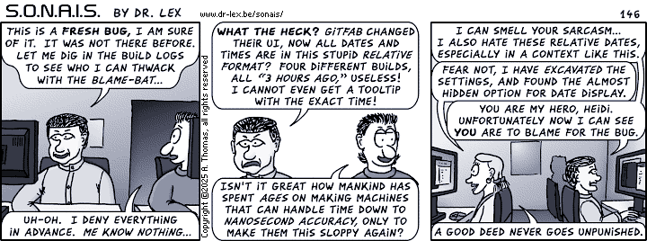
Use only relative dates
It is now trendy to annotate blog and forum posts or anything else with relative or so-called “friendly” dates such as “today, yesterday, 2 hours ago,” and the like. This may seem more natural but it plain sucks when it is somewhat important to know exactly when the thing was posted. It is also terribly annoying when saving a copy or screenshot of a webpage, or printing it. After a few weeks one has no clue anymore to what exact date the vague relative dates refer to, unless somehow the date when saving/printing it was preserved. Even if the latter was the case, then one still has to do cumbersome date calculations in one's head.
Please provide at least some way to switch to actual dates, or better: display both the relative and absolute date, like: “2019-12-24 (8 days ago)”. If you have a custom style sheet for printing, ensure any possibly hidden absolute dates become visible when this sheet is active. When you do believe relative dates are the best thing to display, please provide some way to toggle it to an absolute date, for instance by merely touching the date string.
Anaemic overly minimalist interfaces
For some reason there is this trend of minimalistic interface design. It seems like yet another stage in the awful trend of Google's “material design” which already irked me in its first iterations, and it only got worse with every update. First we had the trend of reducing and removing obvious boundaries between elements in webpages. Now this is being taken to another level by also removing colour, especially in icons. What is left is a bunch of often grey things floating in a sea of white, or perhaps black if the webpage can be switched to night mode. And obviously the sparse text will be light grey on a white background or dark grey on black, thanks to the other god awful trend of reducing contrast. What's the next step, further stylising icons so we are only left with circles, squares and triangles? I hope I'm not giving anyone ideas here, but I have already seen things that go in this direction.
It is again Google who seems to be pushing this trend, with for instance all icons in the YouTube interface being replaced by faint outlines. The UI is only usable by either knowing by heart where all the buttons are, or analysing the actual shape of icons. (Tooltips used to be a life buoy in such cases, but few websites still bother providing them because they are incompatible with touch interfaces, so they are dropped according to a kind of “lowest common denominator” motivation.) It all looks awfully boring and dull, and cryptic. It is not because there are people who cannot see colours, that we have to get rid of those colours everywhere.
To make things worse, YouTube is also outright dropping useful functionality like sorting of videos according to their age. I do not know what is the motivation behind all this, maybe there is none1 and it is yet another silly trend caused by apes mimicking other apes, that will be reversed in due time.
1: the omission of sorting options is understandable (albeit not to be approved). Obviously, dropping the ability to sort videos according to a useful criterion, does make sense for a company which makes more money when people watch more videos with ads embedded in them, because they now have to scroll endlessly through the list to find something and there is a higher chance they will want to watch some of the things scrolling by.
Turn the website into a resource hog by adding unneeded and untested bloat
In the early days, a website used to be a mere collection of static webpages. Nowadays, a website is only considered cool if it is stuffed with tons of Javascript and HTML5 gimmicks. The result is that quite often, I'll hear my laptop fans spin up when leaving a website open for longer than a minute. Sometimes, the entire machine will become slow and unresponsive, and when investigating why, it proves to be a certain webpage that has eaten all the RAM or CPU cycles.
Both problems are the result of copy-paste web design where frameworks are piled on top of each other, used improperly such that resources start to leak and are never cleaned up. The designers of such websites are skilled enough to string the frameworks together, but not to make a neat design and validate it through testing. The website may look nice at first sight, but eventually it will kill the computer or mobile device that tries to keep it open for an extended period. Next time you want to ‘enhance’ your website, ask yourself whether it really is necessary. Maybe you don't even need JavaScript at all. Sometimes less really is more.
Video backgrounds / spontaneously moving layouts
Oh HTML5, what have you done? This is another example of: “it is not because it is technically possible, that it is a good idea.” You probably know what I'm talking about: upon opening a page, the entire background starts moving because it is simply a huge high-resolution video file. There is often no way to stop it, or the button is hard to find… as is anything else amidst all the moving stuff.
Now that this feature is widely supported, it has become trendy to use huge full-screen videos as backgrounds on main pages and sometimes even deeper pages. At some point, the Chrome browser had a toggle for autoplay, which was great. A bit later however, they thought it to be sufficient to always prevent autoplay on videos with sound while allowing it for muted videos, hence they removed the user-configurable option. This has left the floodgates open for stupid video backgrounds.
I have written an article about web graphics ages ago, back in the days when animated GIFs were the only means to animate backgrounds. Even then it was obvious that a non-static background is an absolute no-no except on gimmicky pages in rare circumstances. Your website's home page is, hopefully, not a rare gimmicky affair, is it? Moving backgrounds are damn annoying for multiple reasons, the first of which is of course that it is distracting. When I want to buy RAM upgrades, I want to select my computer model from a list and get the list of compatible modules. I do not want to play a game of finding this list amidst a sea of flashing moving garbage. It is OK to add moving elements to a page, but they must not cover more than like 20% of the area, must stay in place, and must be easy to turn off.
Another reason why this is annoying, is that it eats bandwidth and CPU or GPU power. Battery life is precious, so I hate it when someone runs away with it for no good reason. I have seen this fad come and go on a major bank website, without any doubt they removed it after many complaints. It came back after a while however, apparently the marketing idiots truly believed it was a good idea. I still see this stupid design trend pop up on recent website overhauls, so the wisdom of it being likely to anger customers, has not seeped through everywhere. Hence this fad deserves to be up high in my ranking of things not to do when designing your website.
A slight variation on this, is advertisements or other elements being refreshed automatically without any user interaction, and causing the layout of the page to suddenly change because the refreshed elements have a different size than the previous ones. Is there any need to explain why this is annoying? Just imagine someone snatching your newspaper or book out of your hands, cutting it up in a split second, and handing this mixed version back to you. Don't do this. It is only OK to replace elements on a live page, if this does not cause anything else to move.
Make hyperlinks invisible
This has been a topic even since the first incarnation of this article, and it only seems to get worse but no, I will not capitulate and drop this paragraph.
With the advent of CSS, the possibility to use “text-decoration: none” arose. This means that people can actually turn off the underline for hyperlinks, which has been the default since the invention of the web browser. This is not bad as such, as it allows to tailor the appearance of links to a custom web design. However, many people like to use this to make links totally identical to the surrounding text. Only when the user hovers over them with the mouse they become visible, and sometimes even that has been disabled! The only pointer that the word is clickable in the latter case, is the cursor changing to a hand icon.
Now tell me, do you believe anyone wants to scan every word in every webpage with the mouse, in order to detect where the wonderfully hidden links are? No! Links must be visible at first glance. Whether with an underline, different style, colour, or whatever. Blue-coloured underlined text is burned so deeply into the common knowledge of people, that it is the ideal way to indicate links. On any webpage where the hyperlinks are the main feature (for instance, a search results page), both underlines and the blue colour must be used. On other pages it is OK to drop either the blue colour or the underline, but never both. Neither underlines nor blue text should be used for anything else than links, unless their meaning is clearly indicated. There is never a good reason to make links invisible, except in a game “find the hidden links”. There is one hidden link in this very paragraph. Did you find it?
In this regard, the new layout that Google rolled out for its search results around March 2014 baffled me. They removed the underlines, in what seems to me a change just for the sake of change. They seem to have attempted to bring the layout more in line with the current awful trend of whiteout-inducing user interfaces, with text floating around in a sea of white space with no separators anywhere. Of course everyone else wants to be like Google and started mimicking this, ugh.
Make it impossible to navigate the website by manipulating the URL
Suppose I enter a website through a hyperlink or a search engine, but it is in too deep a level, e.g.,
www.site.com/products/rubberduckies/yellow/aggressive/model2.html
Now imagine I want to see all rubber duckies, but I can't immediately find a navigation link to go to that higher level. The logical thing to do, is to cut off all the parts of the URL after ‘rubberduckies’. In other words, go to
www.site.com/products/rubberduckies/
In a well-designed website, I would then arrive at the page with the overview of all rubber duckies. But in many cases I get ‘permission denied,’ although I am pretty certain that I have permission to see all duckies. I might also get a ‘404 not found’ or heaven forbid, ‘500 internal server error’ depending on the skills of the web developers. This forces me to go back all the way to the main page and re-traverse the navigation structure. That sucks. To prevent this on a basic static web server, it is as simple as naming the main page of each subdirectory ‘index.html’ (or ‘index.htm’ or ‘index.php’). In more advanced servers, there certainly always are ways to make sensible redirects pointing to the kind of page a visitor expects to see when entering a certain URL path.